Computer vs. Hand in Architectural Drawing.


In the architecture world, there are a handful of persistent debates that arise time and time again: the challenges of being a woman in the field of architecture is one of them, for example; the problems of a culture of long hours and hard work is another. But one of the most enduring arguments in architecture – especially in the academic sphere – is the battle between hand drawing and computer aided design. If you are an architect or still an architecture student, which category you are good in? Computer drawings or manual drawings? Or are you good in both? If you are, then you must be doing very great either in your study or in your job.

Me? I can say that I’m much better in hand drawings. Even before I pursue higher education in architecture, I have started sketching buildings on unwanted papers during my years in secondary school (when teachers were not around). There were friends who complimented my drawings and that just gave me further motivation to study architecture. And here, I am, a Part I Architect currently. I like sketching. It’s my hobby. Sometimes, whenever I’m out for a vacation, I would bring a small sketchbook along so that when I have the mood, I can directly draw things on it quickly. Of course, I’m not trying to say that I’m fantastic on my manual drawing skills. It’s just that I’m trained to do that especially since my past 4 years of study in my architectural degree allowed me to focus on excelling in manual drawings.

Michael-Malone-design-sketch-04

Nicholas-DeBrunye-Finalist-Student-Travel-Sketch

So, what about my skill in computer drawings? Ahhaa…that’s where the trouble comes. When I finally graduated with my degree few years back, I realized that I emphasized too much on hand drawings. All my past design works were manually produced and were only slightly edited by Photoshop. That’s all. Not using any CAD softwares at all. I started to feel regret knowing that I’m sucks in computer drawings and that’s a must-have skill when you are out to work. Fortunately, after these few years of working, I am able to improve quite significantly on my AutoCad skill. Well, still not very pro yet. On the other hand, I’m still at beginner level to the 3D modelling softwares like Google Sketch-Up and rendering softwares. I guess it shall be the time for me to work on these skills which are very important in architectural profession.

architectural2

552bd732e58ece2cfd000002_are-computers-bad-for-architecture-_1288291646-2

Hopefully, I can find a balance soon, where I can be very good in both hand and computer drawings. But right now, my stance is that both hand and computer drawings are equally important and both can actually co-exist to bring out the best of design ideas. You can follow my advice which is to focus slightly more on manual drawings during your study years and then when you start work only then you can polish your computer skills. It’s because you will not be able to learn drawing manually once you are out to work. Once you are working, you have to deal with computer drawings everyday and that’s where you can learn and improve on computer drawing’s skill as much as you can. Computer drawings and renderings are cool, accurate, realistic and useful for construction. However, hand sketches are great too when you are at the design stage, when you have no computer while on project site to show out your design solutions, or when you are meeting client and they wanted to see things real quick. Sketch on spot for them and they will be impressed.

The reason I wrote this for my blog post is because that Archdaily is also posting an article on the similar topic recently. The article is here: http://www.archdaily.com/627654/the-computer-vs-the-hand-in-architectural-drawing-archdaily-readers-respond/. It’s interesting to know that finally a famous architectural website is brought it up and I would love to be part of the debate, since I have my personal experience on this issue too.

(Images in this post are from various sources throughout the world wide web)

More details revealed for the mysterious KL118 Tower


After giving my attention on several supertall skyscrapers under construction in China in my previous blog post, it’s time to shift back the focus to one supertall also currently undergoing construction back in my home city, Kuala Lumpur, Malaysia. It is the controversial KL118 Tower. Why I said it is controversial? Because the project is receiving much more criticism than praise from the citizens regarding the need of the city for another supertall building. People also questioned that the budget (over RM 5 billion) allocated for it may be of better use in other areas. It is also criticized for its location as the site of the project is in the vicinity of many heritage buildings (Petaling Street, Stadium Merdeka, Stadium Negara, Methodist Boys School, Victoria Institution, etc) and the tower and its surrounding proposed complex development will leaves huge impact and further heavy traffic to the area.

Whatever the criticisms are, the project is given the nod to proceed but not much details are publicized about the tower since then. The KL118 Tower makes up part of a complex of development known as Warisan Merdeka (Heritage Independence) development that also includes residential towers, shopping mall, etc. The tower itself has 118 floors, and will easily surpass Petronas Twin Towers (452 metres high) as the tallest building in Malaysia. There has been speculations till now over the final height of the tower. Previously, it is tipped to be slightly over 500 metres. Then, the height is revised to allow the building to go taller without adding more floors by amending the design of the spire, the finishing crown to the skyscraper.

So, what’s the height it would be? Based on the elevations or sections drawings available (leaked online), the building will be slightly over 600 metres. The height indicated from the ground floor is at about 75 metres till the top showing 715 metres. Hence, after the reduction, the building will reach full height of 640 metres. However, I think the structure / antenna above the spire will not be counted as the architectural height of the building. Hence, the final height of the tower would be about 610 metres. And there is a feeling in me that I think the tower will be of 615.7 metres (2020 feet high) in the end, to coincide with Wawasan (Vision) 2020; the year 2020 of which we targeted to achieve the high-income / developed nation status for Malaysia. It is also the year the tower would be opened to the public after its estimated completion in 2019.

Official renderings of KL118 Tower:

KL118_render


Menara_Warisan

3D works of KL118 Tower by other parties:

15985839060_8a442b35bb_b


16227355392_6fc375f64e_h

 (Renderings by Atifnadzir, http://www.skyscrapercity.com

Scale comparison of KL118 Tower (third from left) with other built supertall skyscrapers in the world. Petronas Twin Towers are on the most right:


16221630116_e509c1bd95_b


Architectural drawings (plan, sections & elevations) of KL118 Tower. Here you can see quite clearly how the spire looks like, and the observation and viewing sky decks occupy four floors of the tower. And there’s a restaurant on level 113! :

MP PLAN


16163214922_13c0684ccf_o

15575325753_63dccd9c62_b

16194336112_f6fe5a1f46_b


Current site condition ( 2014 – 2019, now still construction at foundation and base level, long way to go):

uSvC9Nc

When completed, it will be one of the top ten tallest buildings in the world (probably in 6th or 7th place). Now, after seeing more images / renderings of the tower, what is your thought on its design which is obviously based on diamond. KL118 Tower (I think the name will change later on when it is opened) is designed by Fender Katsalidis Architects, an Australian architectural firm. It’s a nice, sleek and futuristic design, but I hope that they can do more on its elevations and its top part which is a bit boring. It is not as appealing or as impressive if compared to Petronas Twin Towers besides than its height. Still, KL118 Tower would be a good addition to the skyline of KL.

(Images in this post are from various sources throughout the world wide web)


Building Technology 203 Project 2: Masonry Details of Information Center Building


Today is the submission of the second (final) project of the module of the semester, Building Technology 203. The assignment is called as Masonry Details: Information Center Building. Basically, in a group of five, we need to design an information center building at the entrance of the CyberLake Park, Cyberjaya. The building has to be mainly of masonry units.

For submission, we need to have construction drawings showing all plans, elevations, sections (showing where the details are) and the most important, the 10 details. Besides that, the drawings will be accompanied by a 3D drawing, as well as a sectional model at 1:50 scale.

The interesting elements of it are the curved masonry roof supported by metal pin joint at one end, louvred windows, polyglass skylight, and pergola.

Wow…seems so many things to do…and yes…these few days we spend most of our time on only this project, since the deadline is approaching very soon….many things to do…thanks to the other group members who have contributed so much in success of this project. Thanks again….

During the submission today, it seems so quiet and hidden somehow, because all the models did were already stored in box without being exposed out for us to see and get amazed with. People submitted already, then just left as requested by the lecturers. Everyone would be very tired after the submission. A day rest? No….there is one more, the most important assignment which is the design project and portfolio, as well as the upcoming architecture workshop.

No mood do design, switch to sketching then…


The last weekend which had passed just few minutes ago, seems to be very wasted for me….think…think…think….thinking of design…how to make my design for a cafe stronger? …seems to be lack of inspiration to think of it…aahh….save me out of here!….stuck in the middle of nowhere…

Probably I need do switch to other stuff to do…aah, my hobby comes again, sketching….not sketching design assignment, but sketching my all-time favourite, Kuala Lumpur city skyline from bird-eye view….simply sketch in around 30 to 45 minutes.

Next, time to sketch on the current Shanghai World Expo 2010, current popular global event going on in Shanghai from May till October 2010. This one is really very rough sketches….completed in only about 15 minutes…no mood sketch nice already on this….

After this, coming back to the idea-less design…oh my god! next week is already design submission, and I’m still so chill lately..what’s happening to me? I had still got time to watch movie, loitering around, watching tv, going night market, sightseeing, chit-chatting during these rush hours….

Oslo Opera House


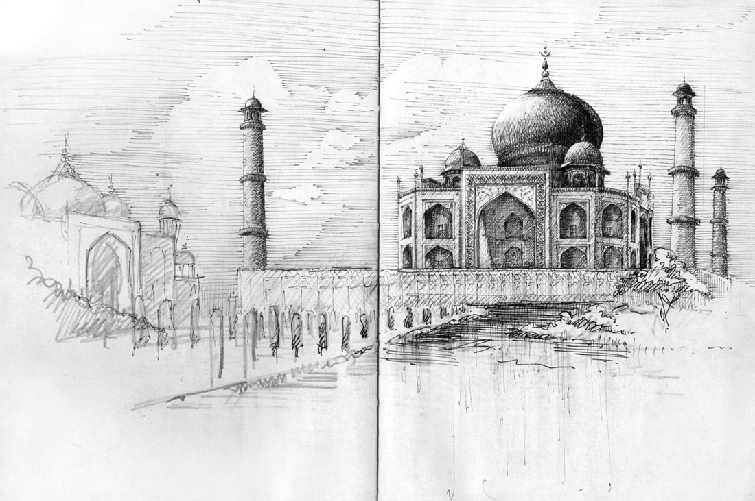
I have discovered this piece of wonderful architecture, when I skimmed through an architecture book. Now, for me, it looks more interesting, when I did some research on performing center and opera house that is related to my project ‘…for the…’ in my Design 102.

Oslo Opera House, construction began 2004 and ended 2007, designed by architect Snohetta, covering an area of 38 500 square metres, and is located at Oslo, Norway.

There are basically four diagrams that explain the building’s basic concept, derived from the architect.

“The Wave Wall”

Opera and ballet are young artforms in Norway. These artforms evolve in an international setting . The Bjørvika peninsula is part of a harbour city, which is historically the meeting point with the rest of the world.. The dividing line between the ground ‘here’ and the water ‘there’is both a real and a symbolic threshold. This threshold is realised as a large wall on the line of the meeting between land and sea, Norway and the world, art and everyday life. This is the threshold where the public meet the art.

“The Factory”

A detailed brief was developed as a basis for the competition. Snøhetta proposed that the production facitities of the operahouse should be realised as a self contained, rationally planned ‘factory’. This factory should be both functional and flexible during the planning phase as well as in later use. This flexibility has proved to be very important during the planning phase: a number of rooms and romm groups have been adjusted in collaboration with the end user. These changes have improved the buildings functionality without affecting the architecture.

“The Carpet”

The competion brief stated that the operahouse should be of high architectural quality and should be monumental in it’s expression. One idea stood out as a legitimation of this monumentality: The concept of togetherness, joint ownership, easy and open access for all. To achieve a monumentality based on these notions we wished to make the opera accessible in the widest possible sense, by laying out a ‘carpet’ of horizontal and sloping surfaces on top of the building. This carpet has been given an articulated form, related to the cityscape. Monumentality is achieved through horizontal extension and not verticality.

The conceptual basis of the competition, and the final building, is a combination of these three elements – The wave wall, the factory and the carpet.

Urban Situation

The operahouse is the first element in the planned transformation of this area of the city. In 2010 the heavy traffic beside the building will be moved into a tunnel under the fjord. Due to its size and aesthetic expression, the operahouse will stand apart from other buildings in the area. The marble clad roofscape forms a large public space in the landscape of the city and the fjord.

The public face of the operahouse faces west and north – while at the same time, the building’s profile is clear from a great distance from the fjord to the south. Viewed from the Akershus castle and from the grid city the building creates a relationship between the fjord and the Ekerberg hill to the east. Seen from the central station and Chr. Fredriks sq. The opera catches the attention with a falling which frames the eastern edge of the view of the fjord and its islands.

The building connects city and fjord, urbanity and landscape.
To the East, the ‘factory’ is articulated and varied.
One can see the activities within the building: Ballet reheasal rooms at the upper levels, workshops at street level. The future connection to a living and animated new part of town will give a greater sense of urbanity.

Choice of materials

The materials, with their specific weight, colour, texture and temperature, have been vital to the design of the building. Snøhettas architecture is narative. It is the materials which form the defining elements of the spaces. It is the meeting of the materials which articulates the architecture through varied detail and precision.

In the operahouse, three main materials were specified as early as the competition entry: White stone for the ‘carpet’, timber for the ‘wave wall’, and metal for the ‘factory’. During the continued work on the project, a fourth material, glass, which allows for the exposure of the underside of the ‘carpet’, has been given specific attention.

Stone

After an international tender competition, th italian marble, La Facciata, was chosen. This is a stone which, in common with other marbles, retains its brilliance and colour even when wet. It has the necessary technical quality in terms of stabitity, density, and longevity. The producer, Campolonghi, has had the professional ability, capacity, and experience necessary for such a large and complex project.
The accessibble area of the ‘carpet’ is approx. 18,000 m2. Its detailed design has been important: the architect desired that it should not interfere with the general dorm of the building but that it simultaneously was articulated enough to be ineresting at close quarters.
Together with the artists several alternatives were proposed before a particular non repetitive pattern with integrated raised areas, special cuts, various surface textures, and specific details were designed to articulate the main geometry.

Timber

Oak has been chosen as the dominating material for both the ‘wave wall’ and the main auditorium.
For the wave wall it has a light and varied surface. Oak is used throughout for the floors, walls and ceilings. The wave wall has a complex organic geometry made up of joined cone shapes. It is also an important acoustic attenuator within the foyer space. To achieve these goals it is made up of smaller elements which can deal with the changing geometry and provide acoustic absorption.
Inside the auditorium oak has been chosen for a number of reasons: It is dense, easily formed, stable and tactile.
The oak has been treated with amonia to give a dark tone. Here too oak is used for floors, walls, and ceilings, as well as balcony fronts, and acoustic reflectors.

Metal

An operahouse is designed and built to have a long lifespan. This means that a simple, modern metal cladding, such as we associate with factories and workshops, needs to be re-evaluated and redesigned.
After a consideration of aesthetics, longevity, maleability and the possibility to make very flat panel, aluminium wa chosen. To give the panels further quality, a collabarative process was begun with two artists.
The design team initially aimed for an industrial modulrity but that the panels themselve should have greater visual quality. The panels were punched with convex spherical segments and concave conical forms. The pattern was developed by the artists based on old weaving techniques.

Glass

The high glass facade over the foyer has a dominant role in the views of the building from the south, west, and north. Early in the project it was realised that this glass faced was more important than previously assumed, both during the day and night when it would act as a lamp illuminating the external surfaces.

The glass façade is up to 15 meters high. It was the architects intention to design a glass construction with an absolute minimum og columns, framing, and stiffening in steel. The solution was to use glass fins where minimised steel fixings are sandwiched inside the laminates.
The requirements for the glass’s stiffness increased due to the desire for large panels and slim joints where the panels meet.
Thick glass of this sort tends to be quite green rather than transparent. It was therefore decided that the façade of the operahouse would use low iron glass.

In all, eight different panels were designed which give a constantly changing effect depending on the angle, intensity and colour of the light playing on them.

Plan solution, general arrangement

plan 1

The building is split in two by a corridor running north-south, the ‘opera street’. To the west of this line are located all the public areas and stage areas. The eastern part of the building houses the production areas which are simpler in form and finish. Comprising 3 to 4 storeys above ground. There is also a basement level – U1 – below this part of the building. The sub stage area is a further 3 storeys deep.

============================================

To know more on the Oslo Opera House, like the spaces in the building (main auditorium, interiors), landscaping and courtyard, drawings and details, please refer to this site:

http://www.archdaily.com/440/oslo-opera-house-snohetta/

This is the source and the information posted here are obtained partially from the source mentioned above.

www.archdaily.com is certainly a good website to find new building designs, and many more, related to architecture, updated daily.

Yoh..AutoCad is cool…


been enjoying around these days on AutoCad, not only in doing assignments but as well as drawing something I like; building! Haha…

There are a lot of functions which I have not known yet, anyway, slowly explore…really beneficial and useful for architects…

Below is the examples of my architectural drawings completed for assignment for Design Communication 101 (in JPEG format)..ONLY FOR REFERENCE, NO COPYING..haha..this one I need several days to complete it, really hard work on it…

Presentation1

Next, one more, not assignment, but I just draw it for fun, my favourite building (current world tallest completed building) – Taipei 101 (no scale).

T101

It’s cool to have this software especially for us as students…

At last, exposed to AutoCad


On these few weeks, at last after a year and a half of my architectural study, I am finally exposed to AutoCad, a software specially for architects to draw the architectural drawings…

AutoCad is a very useful software in drawing all these which requires a longer time if these are done by manual, our hands!!!

Of course, we have to know a lot of functions in the software, and I’m currently exploring every thing in the software…anyway, I started to make progress in understanding AutoCad…

have to catch up my assignment in completing all plans, elevations, sections and axonometrics drawings of a house through AutoCad…

Pretty happy for knowing how to use AutoCad..at least shows something that we are beyond normal people, we are future architects!!! Haha. I think too far again, be ambitious….

Architectural Oral Presentation and Development Progress


Architectural oral presentation , one more thing, this one is simple, what you have to do is:

1. Understand your own applied ideas in your design. Do not memorize.

2. Present with suitable tone, formal wear, good look, and with full confidence.

3. Answer questions that are being asked with full confidence too.

4. Have all the model and boards stand by while you are presenting. Use them as aid in your presentation.

5. Try to interact with the lecturers or clients when you are presenting. Do not make it so seriously sometime. Be interesting and again, be creative! You may use other visual aids too (like Microsoft Power Point, etc) to assist you in your presentation as well.

6. Inform clearly to the clients or lecturers your ideas, techniques, concepts, principles of design, relationship with each other, site context, development ideas, etc. Do not miss out any one.

7. Hand gesture is good. Try to show something more clearly through hands (no legs please) like ponting at some part of the model or presentation boards.

8. Always look at the clients or lecturers to convince them of your design. Do not be scared of looking at them. Always smile too.

9. Do not talk too long, just get rid of something not pretty related to your design. If not, your clients or lecturers will be getting bored too.

10. Always introduce yourself, then begin with introduction of your idea and design, then your presentation, then ending with smile and ‘thank you’. You may want to ask your client or lecturers whether they are enjoying your presentation or not.

Photo above are not mine. (Duno who are the persons there) – Just to show that presentation should be something like this. We can do better than this.

==================================================

Actually, development progress is very important. This is the process where you develop your initial idea (usually not satisfying) to the final outcome of your design (the most satisfying one) after some amendments. This is always accompanied by sketches, prototype models, etc.  Show to your clients or lecturers how you progress too! For students, go for tutorials!

The two examples above are only for you to refer. Not owned by me. The last picture is showing the development in design of Petronas Twin Towers.

==================================================

Well, after all the briefs here, I’m sure you will get a satisfying or even fantastic results from the one who will grade your works. If not, tell me! These are the essential parts in architectural outcomes.